Redoing the Website
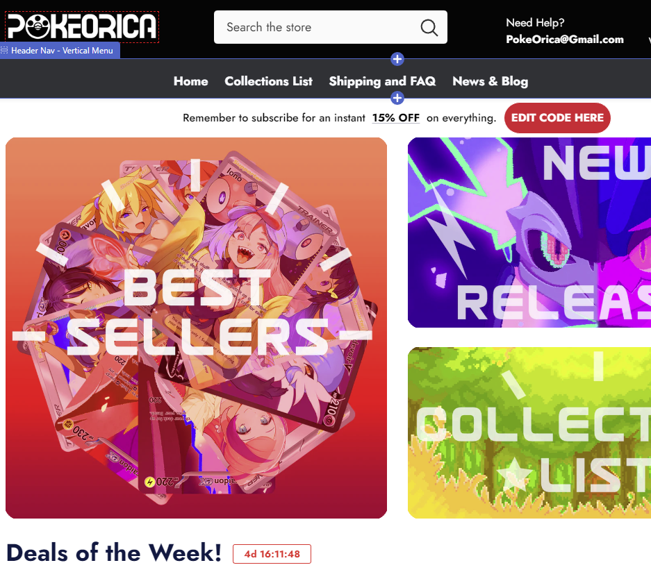
Hey everyone. Hope everyone is doing well! I am currently undergoing a some website reconstruction and in all honestly it looks soooo much better. It's a little bit of a at the moment, but it'll be worth it.
Here are some issues I have with the current website and what I'm doing to change it.
Theme
At the moment, the website is kind of just variations of black and white with no real color other than the product images. It looks good enough, but I want to it to look more like a legitimate website. I've been hard at work making some nice graphics to make it look nicer.
Searching/Filtering
There's almost no good filtering mechanism on the current website. The new one can filter by different collections, nsfw/sfw products, and more. Which should make it much easier to find what you're looking for.
FAQ
The current website is a bit difficult to implement a FAQ bar with a drop down answer thing. The new website has a combined FAQ and shipping/returns section where it's much easier to find answers to customers' most common questions.

Leave a comment
Please note, comments need to be approved before they are published.